Project Outline
1. LOGO DEVELOPMENT
Brandmark
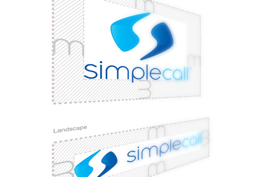
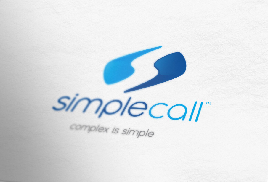
Negative space 's' logo, designed to reflect intelligence of the brand mother persona. Rounded typeface chosen to reflect warmth of the caring brand persona.
Brandmark
Negative space 's' logo, designed to reflect intelligence of the brand mother persona. Rounded typeface chosen to reflect warmth of the caring brand persona.
Wordmark
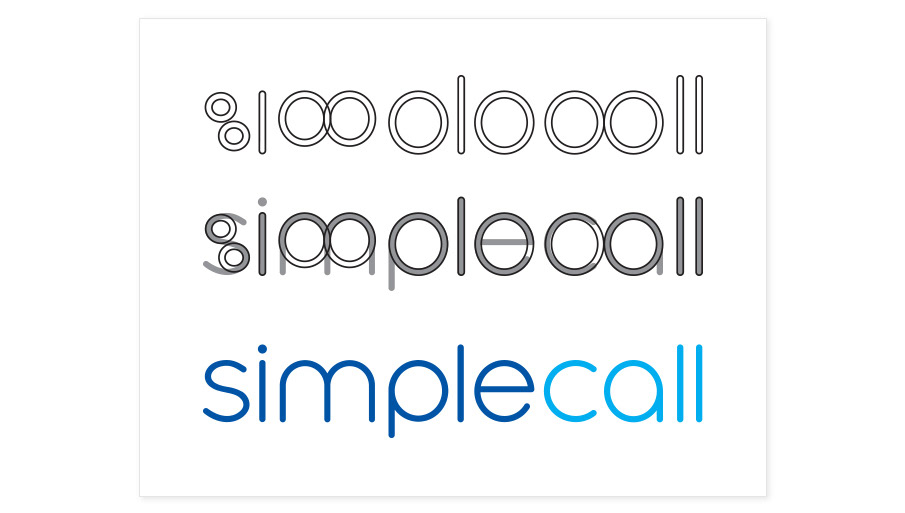
binary code: reference to ones and zeros — the “language” of technology.
binary code: reference to ones and zeros — the “language” of technology.
2. GUIDELINES
Brand Manifesto
"The underlying philosophy is that we are not afraid of complexity. We make the complex simple and therefore ‘complex is simple’ for us. This not just a bold statement, but it is a lifestyle and belief that inspires, motivates and demands attention."
Brand Manifesto
"The underlying philosophy is that we are not afraid of complexity. We make the complex simple and therefore ‘complex is simple’ for us. This not just a bold statement, but it is a lifestyle and belief that inspires, motivates and demands attention."
Photography Style
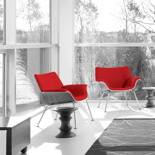
Image desaturation reflects simplicity. Complexity and simplicity of the same object show in each photograph set.
Illustration Style
Idea Generation
Stationary
Identity
Merchandise
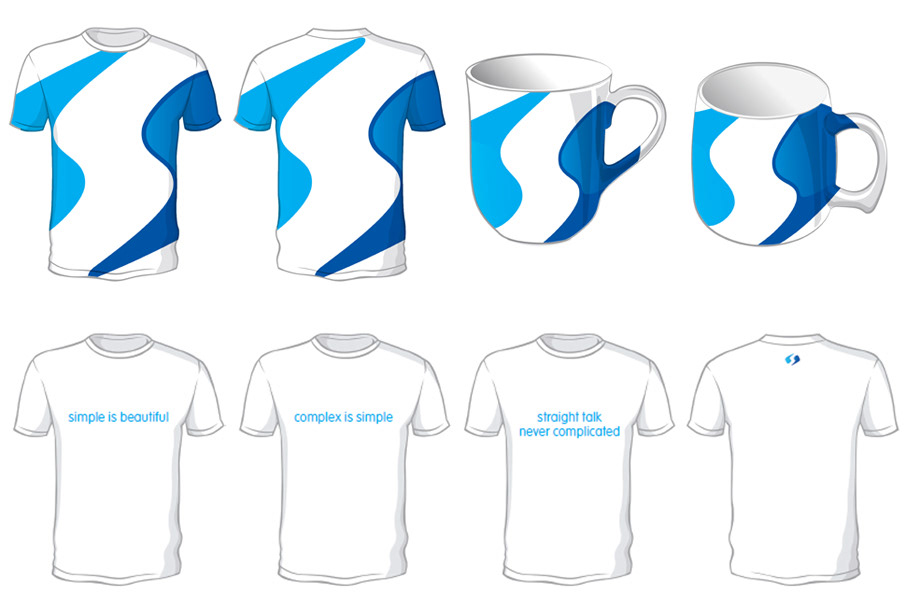
The mug has exaggerated curved features to match the softness and warmth of the brand persona.
Provocative statements on the T-shirt are intended to generate discussion.
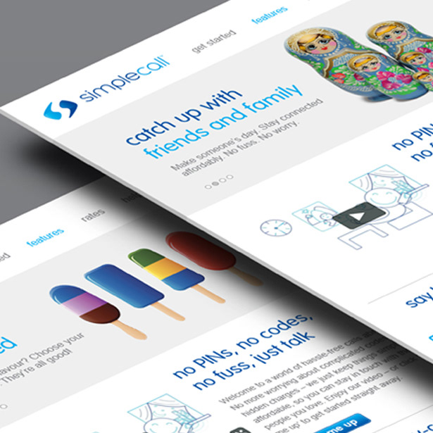
Website Concept
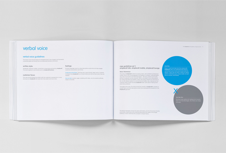
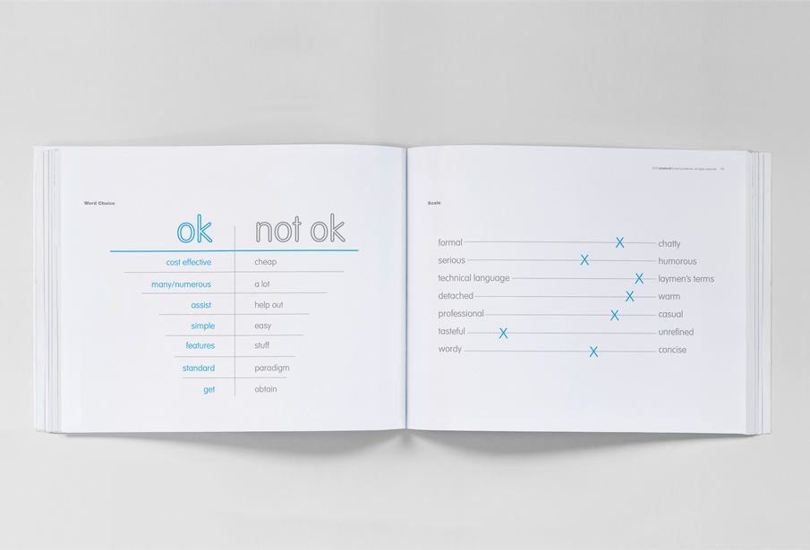
Brand Guidelines Book
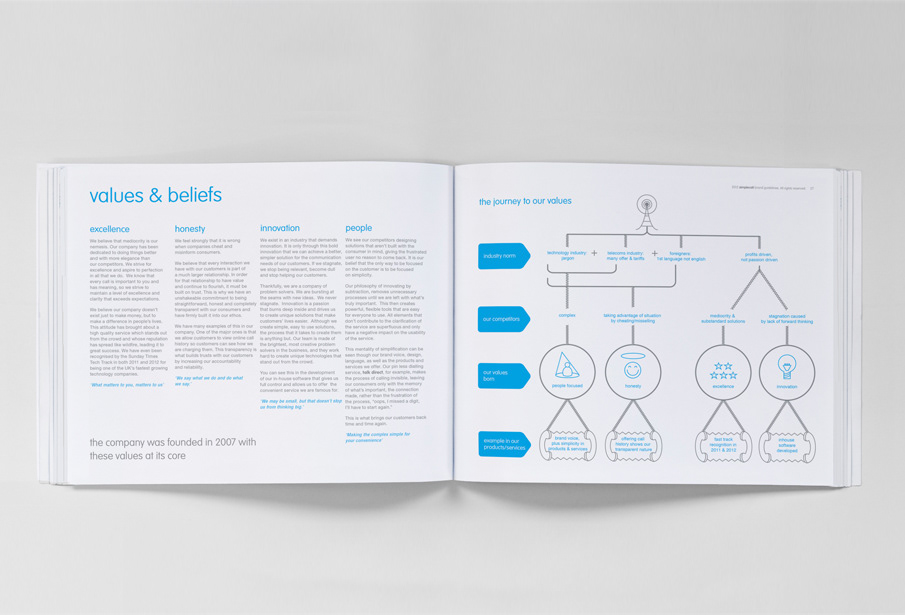
Overall layout planning of brand book
Heavily involved with the:
1. brand strategy
2. creative for the brands visual voice
3. copy editing for the brands verbal voice
1. brand strategy
2. creative for the brands visual voice
3. copy editing for the brands verbal voice


2. Creative - visual voice
3. Copy direction - verbal voice

3. BRAND EXPERIENCE
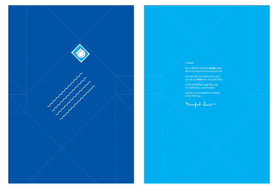
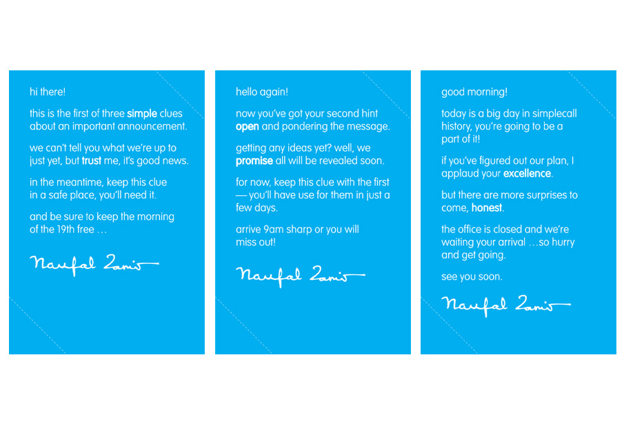
Event teasers/puzzles created using the new logo to illustrate the brand theme of 'complex is simple' and to create an on brand experience.
Event teasers/puzzles created using the new logo to illustrate the brand theme of 'complex is simple' and to create an on brand experience.
Above: Working out how the logo may split & connect.
Each week employees received a part of the logo with a riddle and a part of a map to the venue on the reverse. They didn't immediately understand which made the whole thing 'complex'. Upon the delivery of the last piece of the jigsaw it all made sense and was 'simple'!
Watch the brand experience video below:
Employees followed these blue symbols which were strategically placed on the street to find the 'way ahead' for the venue on the day of the event.
On Brand Programme Guide
A play with typography revealed a 'complex' pattern, when 'simply' folded revealed the brand theme.
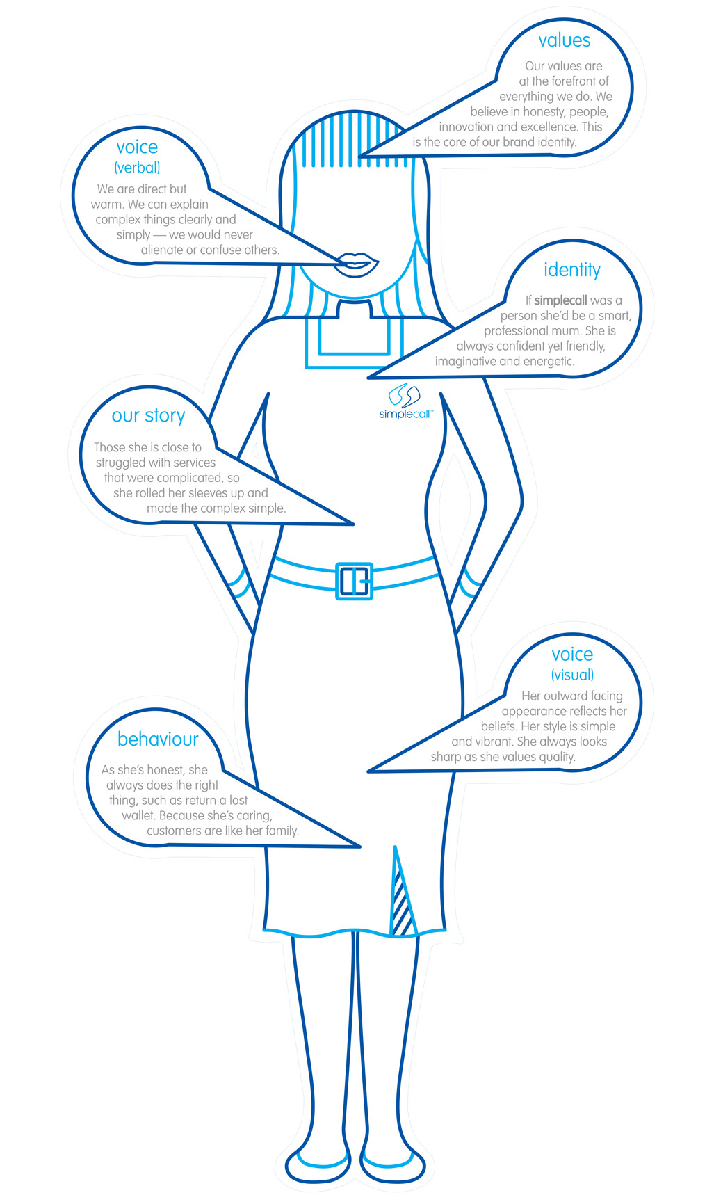
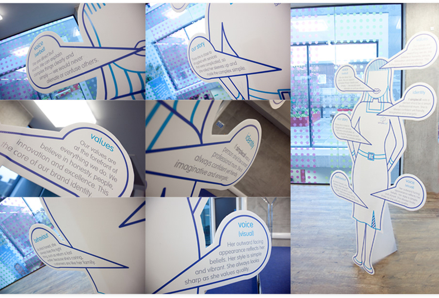
Brand Persona
The brand was brought to life through an analogy of a living being, (in all its 8 foot glory).
This was used not only to illustrate the identity, personality, and behavior of the brand but also the values, background story, visual and verbal voice (design and copy styles).
On Brand Experience
Chinese finger traps used to illustrate the brand theme of complex is simple and to create an on brand experience.
Fingers become difficult to release once inserted; a natural reaction is to pull out for the trap. The person is left struggling with a 'complex' problem, however fingers are easily released when pushing further into the finger trap. Simple!
Office Surprises
After the event, employees were met with some surprises, brand gifts and new branded environments.
On Brand Gifts
On Brand Pop-Up Desk Drop - To remind employees of brand values.
After the event, employees were met with some surprises, brand gifts and new branded environments.
On Brand Gifts
On Brand Pop-Up Desk Drop - To remind employees of brand values.
Digital photo frames - which illustrated the 'complexity' of manually compiling a photo album, but digitally a USB stick is 'simply' slotted in. The product also reflects the technology and importance of family aspects of the brand.
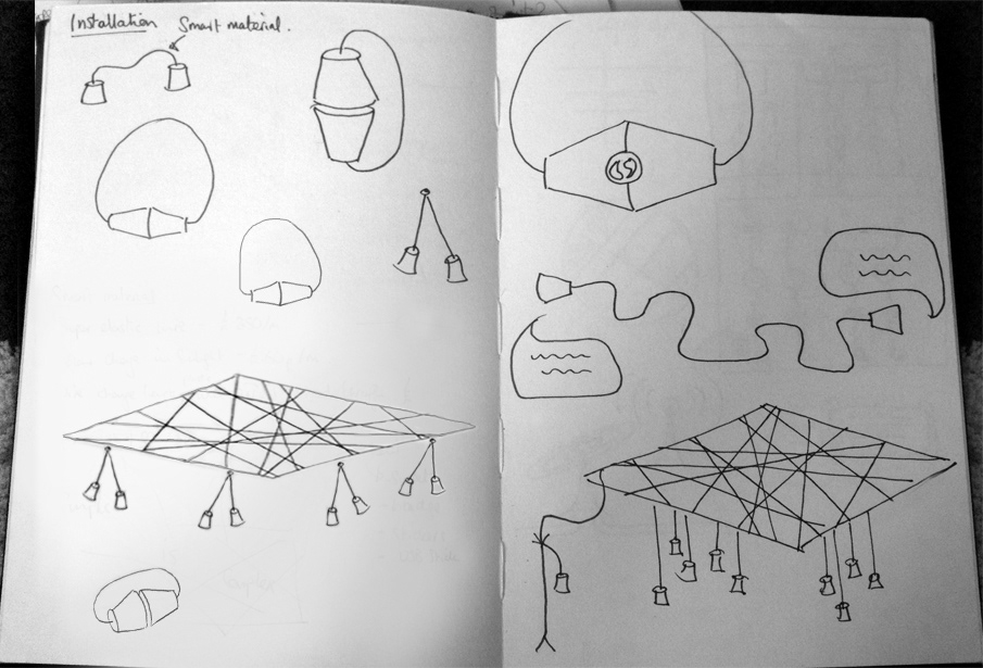
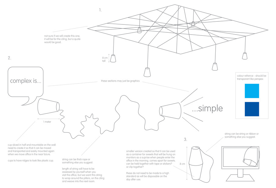
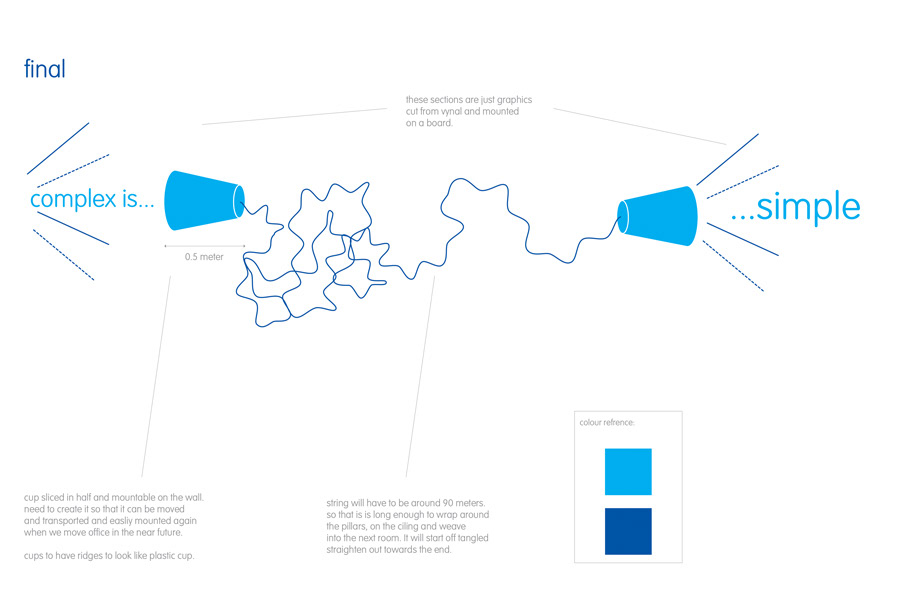
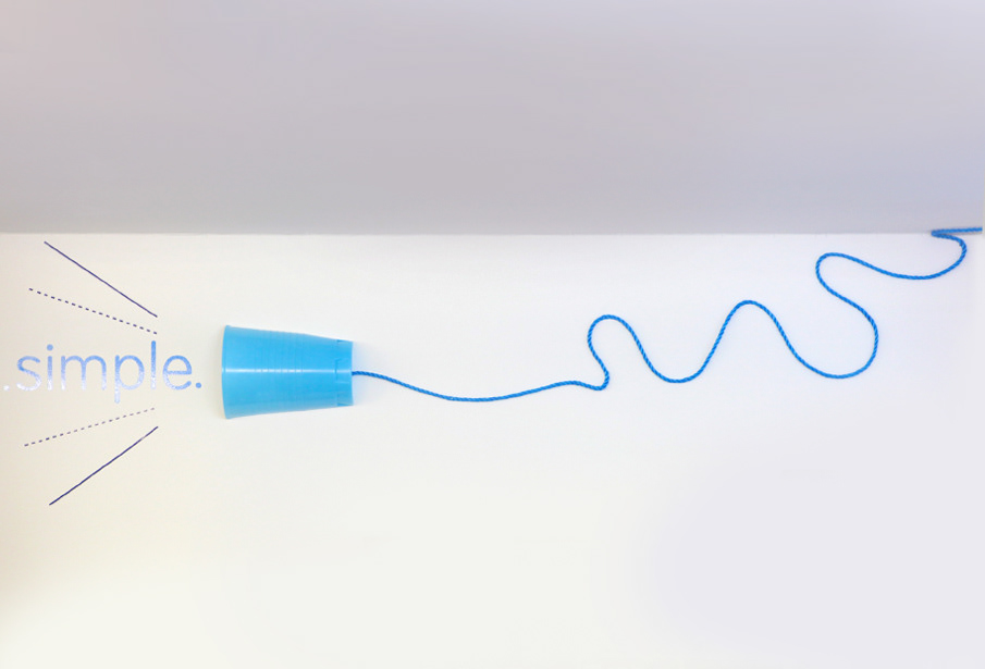
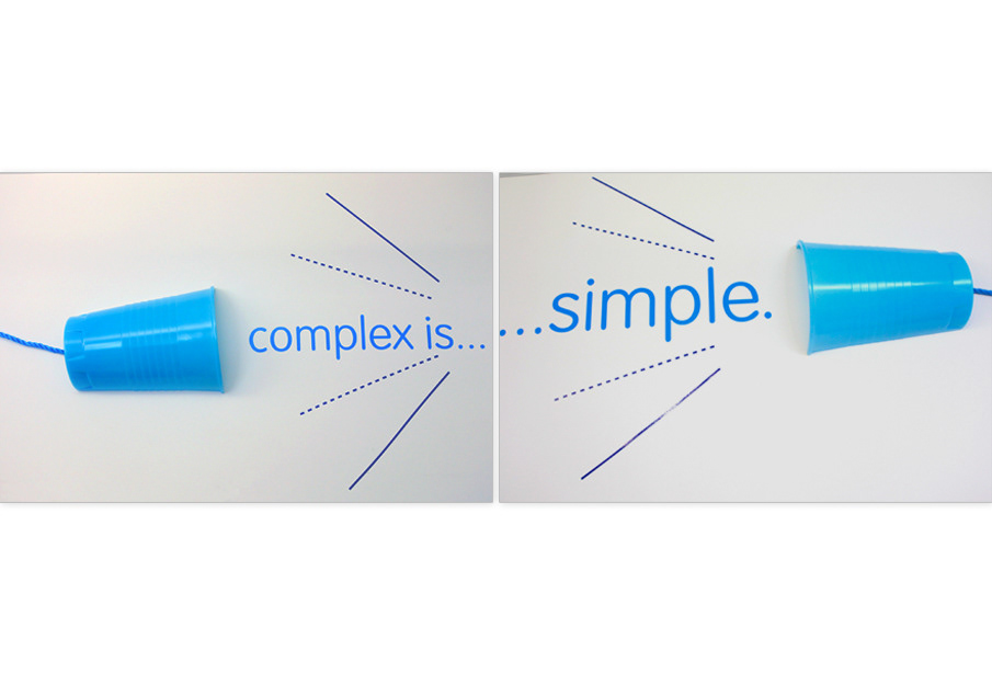
Sweet container - Reflects 'complected' telecommunications company can be 'simply' represented with cups and stings.
Sweet container - Reflects 'complected' telecommunications company can be 'simply' represented with cups and stings.
4. Branded Environment
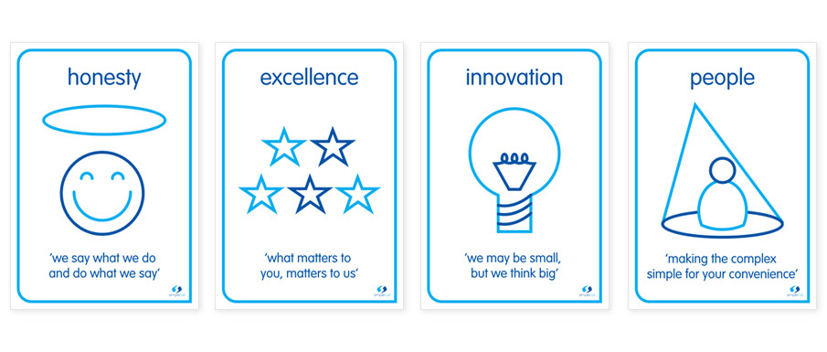
Posters - to remind them of the brand theme and the brand values.
Posters - to remind them of the brand theme and the brand values.

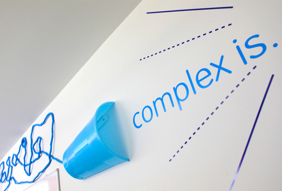
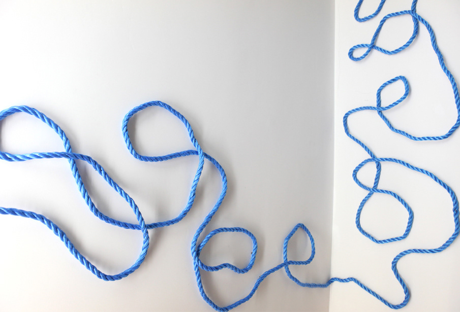
Corporate Brand/Art Installation - Reflects 'complected' telecommunications company can be 'simply' represented with cups and stings.
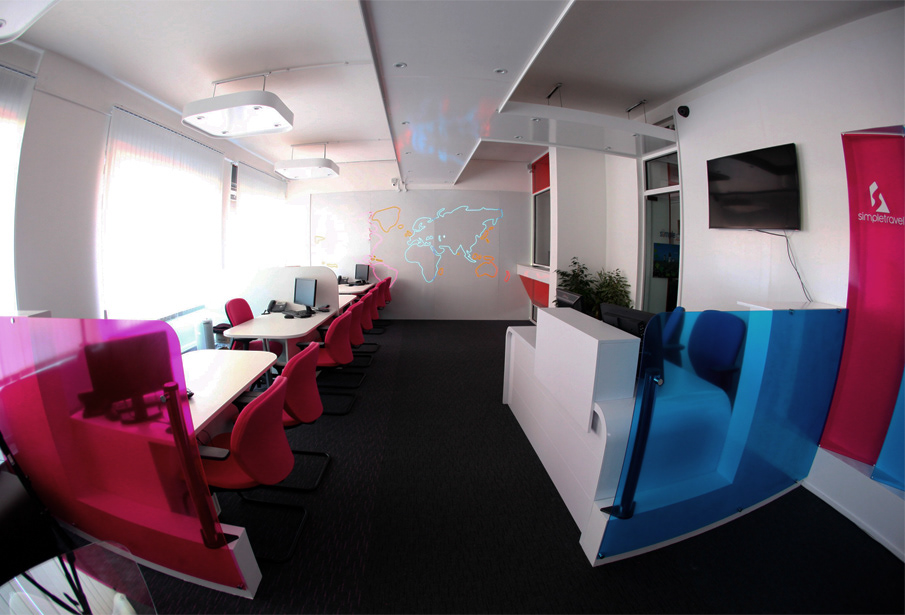
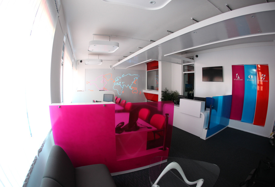
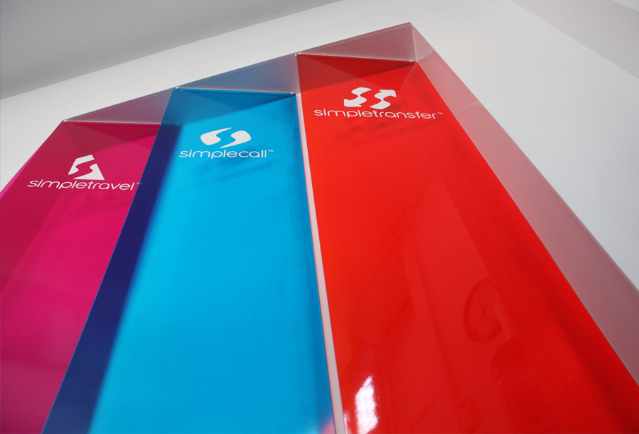
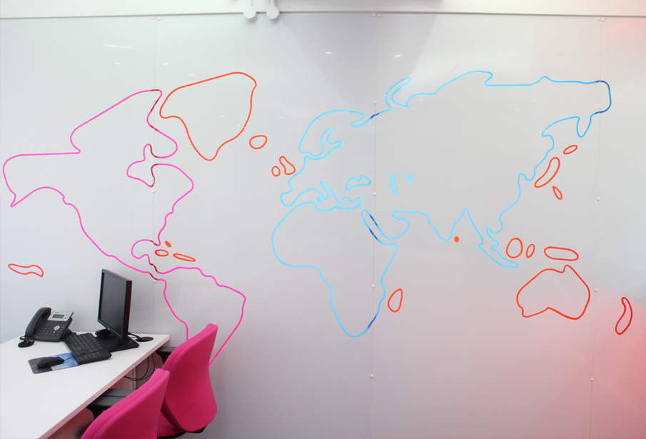
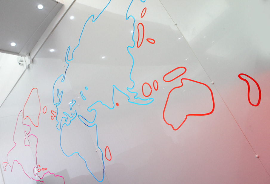
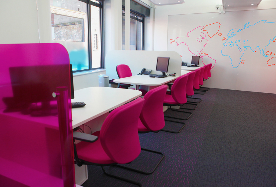
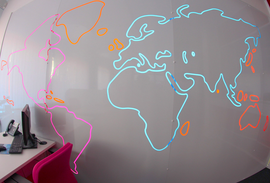
Interior - Applying brand visual voice to an interior bringing 3 sister brands in a small space, international calling, international money transfer, and traveling.
